Research
RESEARCH OVERVIEW
1.
Market Research:
.png)
-
Heuristic Analysis
-
Social Media & App Stores Reviews
2.
Usability Testing:
Existing App
.png)
04 Users
3.
Usability Testing:
Low-Fidelity
04 Users
Primary Research
- User Interviews
- Competitive Analysis
- Competitive Analysis
4.
Usability Testing:
High-Fidelity Prototype
04 Users
USABILITY TESTING PHASE 1 (COWRYWISE APP)
After completing my market research, I came up with a recruitment plan and interview questionnaire which would aid me in getting insights from participants. My target audience was narrowed down to first-time and inactive users of the Cowrywise app. I aimed at validating my hypotheses, observe user interactions with the product, as well as identify other user pain points in the onboarding process.
My conversation with the customers revealed that they found some details and wordings on the app to be confusing, and they also felt lost sometimes while trying to understand how to save and invest on the app.
AFFINITY MAPPING - KEY Insights

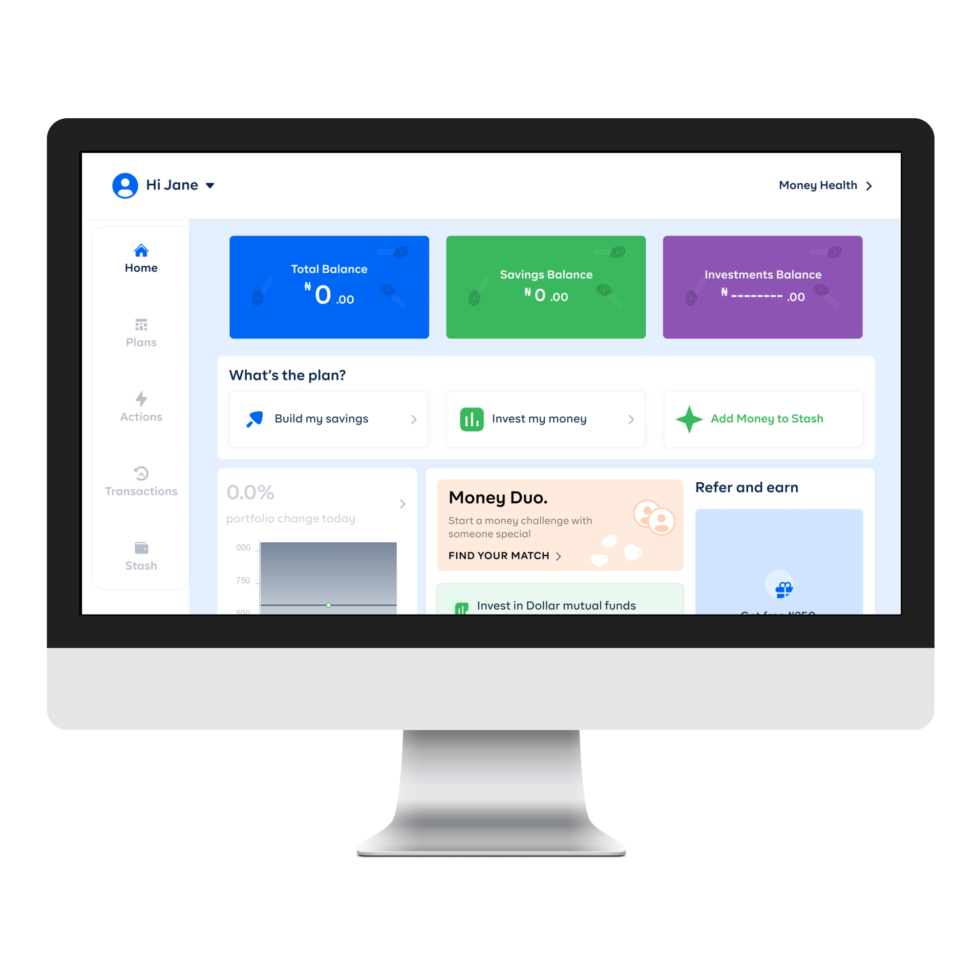
Savings
New users are automatically redirected to regular, locked savings instead of showing them the different savings plans or dashboard - The dashboard is a bit hidden and unnoticeable.
Investments
Users don't understand most complex words while trying to save. - A user got demotivated from continuing, while some had to go on google to search for some terms e.g. mutual funds, etc. before they could continue

Overall I discovered that although the sign up process was straightforward and seamless, getting onboarded into the app was the main difficulty which new users faced. And it was difficult understanding the app at first go. Users had to go and come back months later with a resolve before being able to perfect their knowledge of the platform.
Prototyping ✨
PROPOSED SOLUTION
The strategy for the proposed solution was to add a brief info on specific features, and also to apply heuristic principles that would help users understand the system status in order to make the onboarding understandable and hitch-free, which would result in satisfactory experience for the users, and in return increase customer retention and product adoption.
New User Flow Diagram

Low-Fi Wireframes
I used the gathered insights from the usability interview to brainstorm ideas that would create a better user experience all through the app, while remaining aligned with business goals.
I came up with 3 wireframe variations before deciding on a final one that met business and user requirements better.
.png)
.png)
To avoid repetitions and confusions, password requirements are included for a straightforward signup process. Terms and conditions are also placed before the submit button for legal purposes and to ensure users are able to understand that it is a requirement for successful registration on our product.
.png)
Except during emergencies, users who signup on a product typically like to explore its features first, to see what the product offers and if it suits their taste; hence why I included a return to dashboard button, but still allowing the business target to accomplished by not excluding the pop-up screen after signup.
.png)
The 'FAQ's' section here accomplishes two major actions - helping users learn more about funds and investments, and other technical words on the Cowrywise app, while also helping to ensure that they don't minimize the product to learn more on google, ultimately and potentially getting distracted.
.png)
This screen was totally absent on the app; when a user decides to build their savings, they don't have the option to choose between building emergency funds or any other savings plan and are automatically redirected to locked savings, which leads to frustrations and disputes later; which is why this screen is included to give them the flexibility to choose whilst understanding the differences.
Usability Testings Phase 2 (Low-Fi Wireframes)
I conducted the testing with another four (4) sets of participants.
AFFINITY MAPPING - KEY Insights

-
No explanation on the investment portfolio types, e.g. conservative, moderate and aggressive. And also descriptions on the naira and dollar mutual funds.
-
Some users didn’t really understand the differences between regular savings and emergency plans.
-
The slide-up when a first time user enters the dashboard is intrusive, as users would like to explore the features of the app first.
Iterations AFTER USABILITY TESTING
Included password requirements, to prevent repeated user errors.
Removed the intrusive screen and placed the elements as primary components on the homepage, this way the user either goes straight into what they downloaded the app for, or explore the apps features first.
I included locked and unlocked tags on regular savings and emergency plan cards respectively, so users would be able to differentiate between them.
I made the FAQ's (Frequently Asked Questions) obvious on the screen, so users would be able to scan through, and learn more from them. This way, they're within the app and can avoid distractions.
.png)
Placed a description on the investment type underneath the titles, so users would be able to read on them and have a good idea what they mean and what differentiates them.
Impact ⚡
PROPOSED SOLUTION
I gathered data alongside colleagues and compared it to our previous metrics. The results were as follows:
75%
of participants that tested the final prototype found the signup process straightforward and hitch-free.
60%
explored the user dashboard and were interested in starting a savings plan / investment.
85%
of users remained in the app after going through and understanding complex investment words in-app, and proceeded to investing.
MOVING FORWARD 🔁
My experience while working on this project opened me to the realization that my perspective when auditing products and coming up with hypotheses might be completely different from what the users of the products experience.
Also, that, each user’s experience is subjective, and might change from time to time. Just when you think you are done finding major problems, users would point out a completely obvious one that you might’ve missed with other users. This makes design iterative, and also shows that experiences differ from person to person, which is why having user personas can help to narrow down on what parts of the product we should improve on first.

-p-1600.png)

.svg)


.png)


.png)
.png)
.png)